

As a project manager, I often need a clean, professional way of showing a client what a project looks like via a Gantt chart or timeline, usually in a PowerPoint presentation. Often times, the information needs to be high level, too – so there’s nothing wrong with having a separate tool just for presenting this information. Sometimes you just want to impress your clients with more than technical knowledge, right? I believe presentations should be useful and shiny.
Gantt charts / project timeline solution requirements:
- Easy to set-up
- Easy to maintain (it’s not if a project will change, but when)
- Supports both task blocks and milestones
- Shiny factor – it’s important to look good, preferably with little effort
- May be a separate tool than normally used for project planning
Note #1: I have not received any kind of compensation: my opinions are completely my own.
Note #2: The rating does not reflect the product as a whole but simply as a solution for high level planning and customer presentations.
Here are the different solutions I reviewed:
| Solution | Summary | Rating |
|---|---|---|
| Drawing tools Microsoft PowerPoint | Easy to set-up but difficult to maintain | |
| Colored cells in Microsoft Excel | Easy to set-up with more granular detail than PowerPoint, but difficult to maintain | |
| SharePoint / Office 365 project site Gantt chart | Good enough for an overview on a project site but not for a customer presentation | |
| Microsoft Project | Very granular, interesting changes but too detailed for presentations | |
| Microsoft Visio | Easy to set-up but very dated and and a little difficult to maintain | |
| Office Timeline | Easy to setup, easy to maintain, gorgeous |
I did look into a few online alternatives such as Smartsheet Online Gantt Chart, Team Gantt and Tom’s Planner. Tom’s Planner made it the furthest, but none of them were actually used in the final draft of a presentation towards a client. These were oriented more at long term project/resource planning and not the kind of presentation I was looking for.
Microsoft PowerPoint
PowerPoint’s drawing tools, in combination with a table, can be a valid solution for maintaining a global project plan. As a junior project manager, this is the most common approach I had seen – and I realized that I absolutely hated it when a project plan needed to be updated.
This is quick to set-up and the drawing tools help set alignment / distance to keep it neat. It also is easy to match to your PowerPoint theme as you can simply select the colors. If you’re already in PowerPoint for a presentation, why not just use PowerPoint for the chart, too?
However – it is not a very granular solution and it is difficult to show details. It’s also difficult and time-consuming to update when the project changes. I find it difficult to make this look truly professional.
Bottom line: It works. It’s a good quick and dirty solution, but it’s difficult to maintain and not really polished.
Cost: part of Microsoft Office
Solution rating: 3/5
Colored cells in Microsoft Excel
Excel is a pretty good project planning tool. It really shines when you want to do calculations in your planning, i.e. with hours per task, per resource, per week, etc.
Here’s an example of a project planning in Excel with all of that kind of stuff:
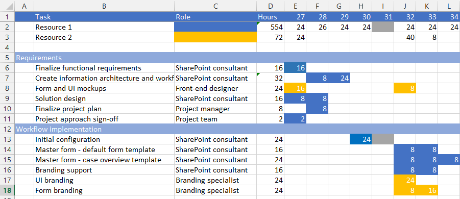
This works great as a detailed planning! It’s a wonderful tool to have as a project manager during a project.
However, it is not shiny enough to put into a presentation to a steering group.

I could certainly dress this up some more by removing the grid lines, adding labels to the arrows and star, etc. However, If I wanted to center the phase labels, I would need to merge the cells together. Even now, it would be frustrating to go back and adjust this planning when something changes – if I needed to un-merge cells as well, it would become a nightmare.
Bottom line: it allows for more detail than PowerPoint, but really doesn’t look very nice. It’s also very difficult to update.
Cost: part of Microsoft Office
Solution rating: 3/5
SharePoint / Office 365 project site Gantt chart
When the new project sites launched on Office 365, they came with this really cool Gantt chart that was fed from the task list! You can even manage it from Microsoft Project if you like! Awesome! We can now manage all of the project tasks and planning in SharePoint! Sweet!
Well…
I’ve now tried three different projects using this task list with different people, different approaches, etc. I think it’s good for (very) simple projects, but it just takes so much time to keep updated with so little return. I think it’s going to go the way of the announcements webpart: great in theory but not used very much in practice.
When you first create the project site and have an empty task list, it is very clean:

You can go ahead and edit the task lists to add your tasks:

And you can choose which tasks are shown on the timeline by clicking on the … and choosing “show on timeline:
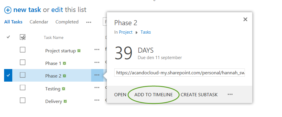
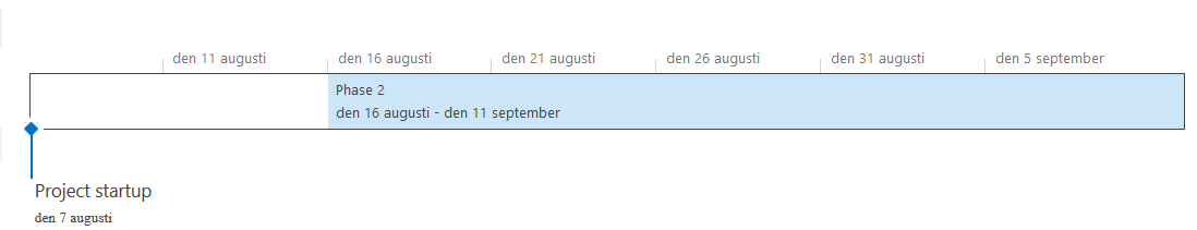
As we have only set a due date, the item shows as a milestone. Note that the scale of the timeline has dynamically changed from August – September in the first screenshot to weeks in the screenshot below:

If you go in and set the start date of the task, it can be displayed as a phase:
This is a nice looking solution. If you keep the number of the tasks simple, it can be a good tool for your project site. However, it’s another thing to keep updated beyond other project management tasks. This just isn’t shiny enough to take a screenshot of and share with a client – it’s really a working tool.
Bottom line: simple tool for showing a project timeline, but not shiny enough for a client presentation
Cost: part of SharePoint / Office 365
Solution rating: 2/5
Microsoft Project
Microsoft Project is an incredibly powerful tool. It is focused on project management, project planning, resource management and even portfolio management. Especially when Project server is involved, this is a force to be reckoned with.
In the screenshot below, you can see the same project timeline example, but now set-up in Microsoft Project. The Gantt chart is automatically generated based on the tasks and their information. The timeline at the top can be set by choosing to include tasks in it (similar to the SharePoint project site example). I didn’t actually even know this feature was available in Project! You can find more information on how to configure it here.

While Project does a nice Gantt chart on the fly and the timeline looks somewhat shiny, I still can’t see putting this in a high-level client presentation. While Project is an excellent planning and project management tool, the displays are still too granular for presentation purposes in most cases.
If you are using Project, you tend to have strong reasons for doing so – if you are using it, then this may be a possible solution for your presentation needs. If you aren’t using it, then the timeline feature is not a reason to start. Note also that Microsoft Project on a separate licensing model than the standard Microsoft Office. However, if you are using Project for project management, you have the benefit that all of the information is saved in one place and the charts would be automatically generated.
Thanks to Monica Mortensen for her support with the screenshots and the deeper information regarding the timeline!
Bottom line: Microsoft Project is really a working tool and not meant for presentations though the timeline functionality is a nice start
Cost: Dependent on the product chosen
Solution rating: 3/5
Microsoft Visio
When I was asking around for tips on approaches for creating these kinds of timelines, I was really surprised to get Visio as a suggestion! Thanks, @Wictor Wilen!
Visio has a Gantt chart template with some basic configuration:
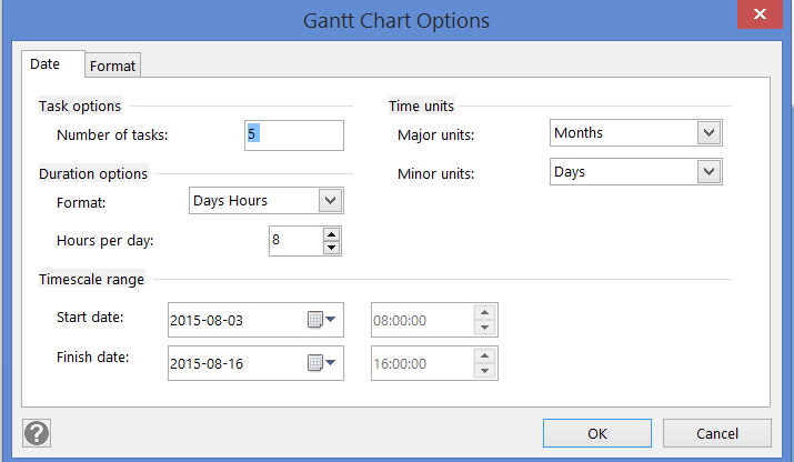
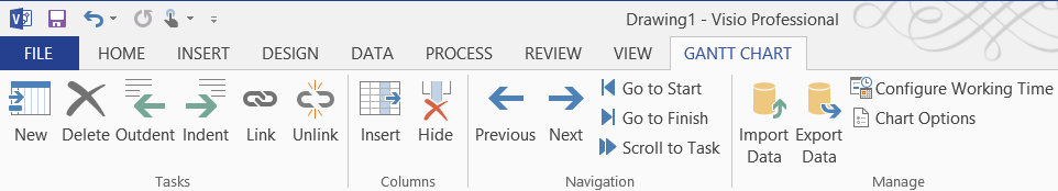
You have a “Gantt chart” tab in the ribbon which allows access to useful tasks such as indenting/outdenting tasks as well as task linking. Clicking “Chart options” brings up the original dialog again. This is good stuff!
You then work directly in the generated chart. The dates do not have a date picker (you need to manually fill in the date) which was pretty off-putting to me. On the other hand, you can fill in the start date and then number of dates; Visio will fill in the finish date. I was very surprised to note that you could drag and drop the bars in the Gantt chart and the dates would update! This works both for changing the date and making the task longer or shorter.
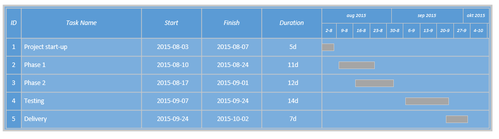
I once heard that Visio is most like Excel than PowerPoint due to its information management possibilities. This Gantt chart gives excellent control over the data!
However – no matter how I fiddled with it, I never managed to get the chart actually looking shiny and professional. Again – it’s a good working/collaboration tool, but not a great solution for presentations.
Bottom line: good data management but does not does not look polished
Cost: extra Microsoft Office license
Solution rating: 3/5
Office Timeline
I resisted trying this product for the longest time. It turned up a number of times during my searches, but it felt like the information I found was more promotion than personal preference. Once I tried it, I never went back to any of the other options.
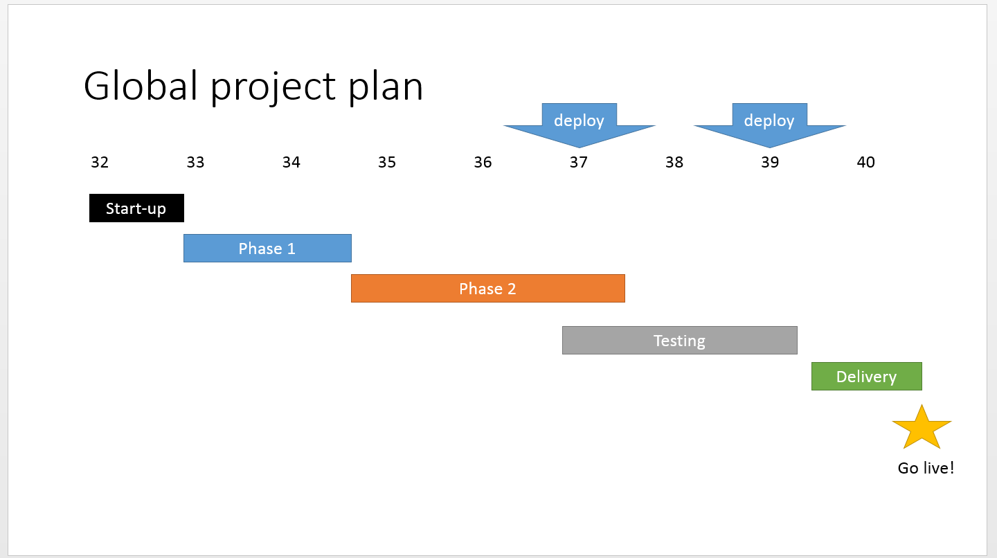
Here’s a real example that is for an on-going project:

There are so many things in here that I think are so helpful to a project manager – here’s a start:
- Scale is configurable
In this case, April – September worked the best, so I set it to months - Timeline is updated based on the date that the diagram was last edited
I edited it on 3 August, so it is showing the red status bar as the beginning of August - Multiple icons and colors for milestones
I was able to use one icon and colors for deploys and a different one for an internal deadline - Clearly set phases with different colors / text styles
You can see that I’ve been consistent in setting the phase names to the left, with a dark blue color. Development is always teal and testing is always orange. These colors are also based on our corporate theme colors. - Show percentage complete of tasks
I update the percentage complete of each task before each client meeting - Hide unnecessary information
You can’t see it, but this diagram actually has rows hidden – it also has information for each of the project member’s big summer vacation. I hid it because it was too much information for this context.
Obviously, my own internal working documentation for the project is much more detailed, but this provides the client with such a clear overview of what is going on with the project.
Each week, I copy/paste my weekly update PowerPoint presentation and simply modify the diagram as needed. When we replanned the project, it was not difficult to update this diagram, either.
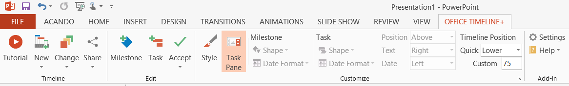
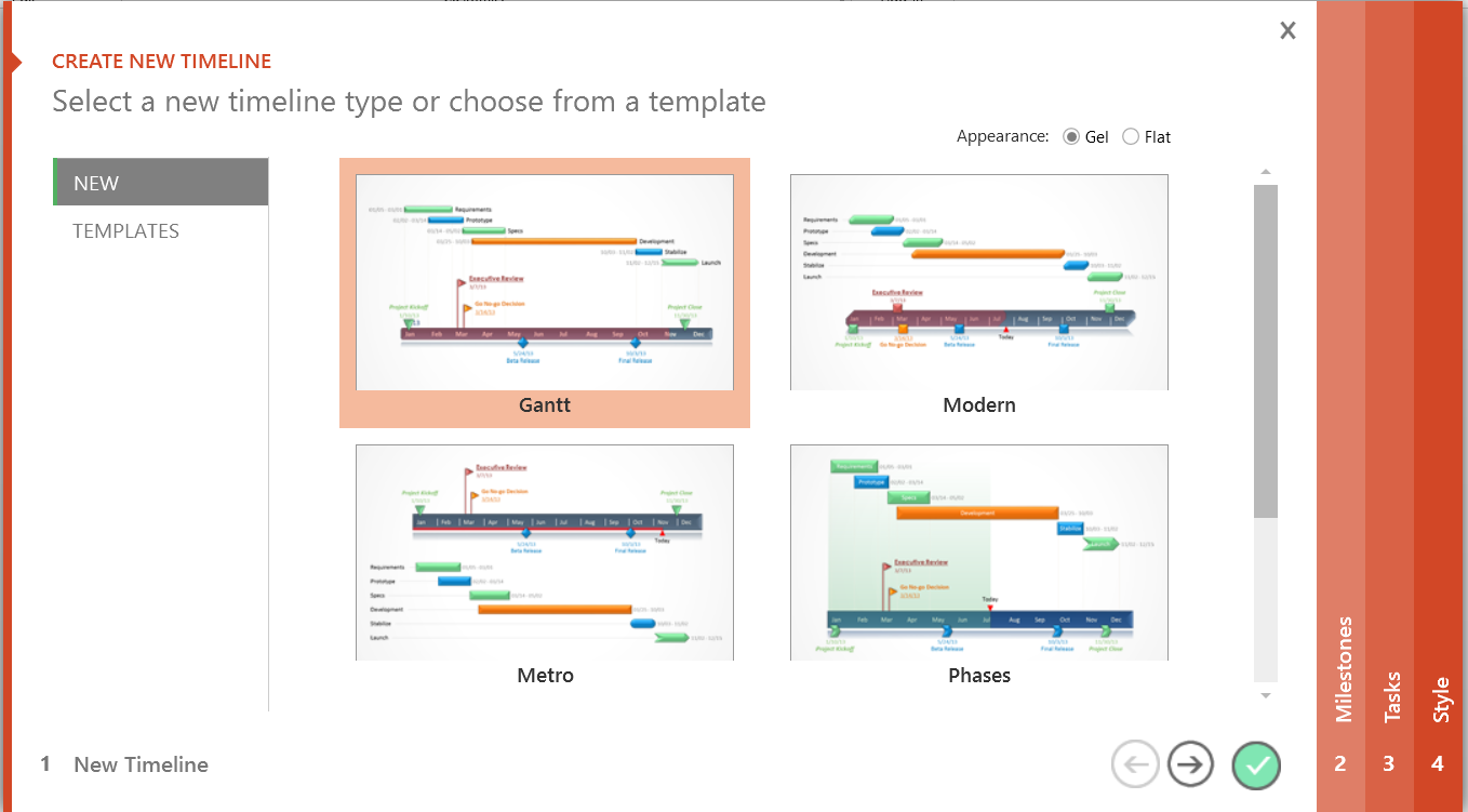
Office Timeline is a PowerPoint plugin which needs to be installed on your computer. Once it is installed, you will see the Office Timeline tab on the ribbon.
Get started by clicking the “new” button, where you can choose your starting template. You can change this at any time on the fly later.
Note that there are numbered vertical tabs to the left and right of the dialog: these are used for inputting the milestones and tasks as well as editing them later.
The following screenshot shows the editing tasks screen. In this case, it has a date picker, it shows the week numbers (!) and you can choose the number if days if you like. If you have the plus version (as shown below), you can rearrange the tasks as well as change the task shape. My only complaint is that the date picker can be a little finicky and doesn’t always like to jump backwards/forwards multiple months.
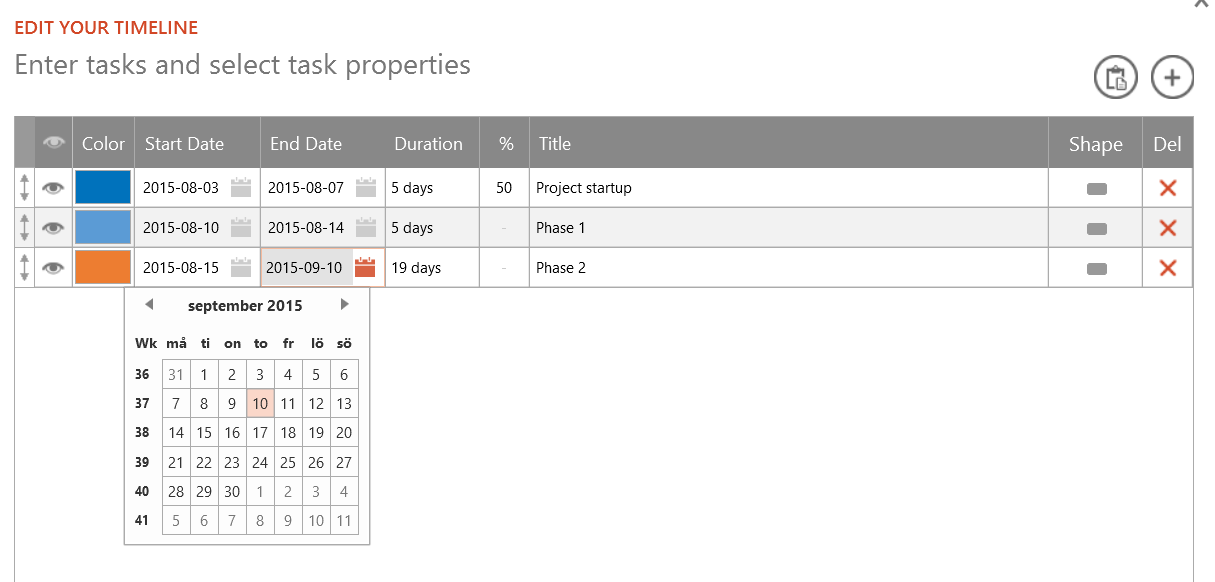
I spent about a month with the free version but did eventually go with the plus version. The screenshots have been taken with the plus version, which is why you may see extra functionality. Particularly being able to show the task percentage complete as well as rearranging the tasks are incredibly useful for ongoing projects.
Bottom line: Go download the free version! You will not regret it. This is hands-down my favorite solution as it meets all of the original criteria.
Cost: free / $49 per year for a single license
Solution rating: 5/5
Closing
After eight months of Office Timeline, I wouldn’t want to use any of the other solutions. It’s good to have them in your toolbox as options, especially as they have many other uses.
What do you use for customer presentations?

We have a Gantt chart tailored for SharePoint on Office 365 that you install via simple drag and drop of 1 file (no need to bug the admin). It let’s you work with one or more task lists across one or more sites without all the clicking. Plus more, of course (multiple undos, basic scheduling, resource costing, etc…) that run on any device with a modern web browser.
https://www.intelligantt.com/SPPackage1/help/minimum_installation.html
Hello, Hannah! Thank you for including Office Timeline in your comparison of worthy timeline solutions. We are thrilled to know that you are having a great time using it and that you find it to be so useful in your work.
If any of your readers want to give the Plus edition a try, they can sign up for a 14 days trial using only their email, no account or credit card required: https://www.officetimeline.com/14-days-trial
We are also preparing an update with some cool new features such as apply to all, so please make sure to update the app when notified. Thank you!
Best wishes,
Sebastian Stingu – Head of marketing